|
Dec. 3, 2015 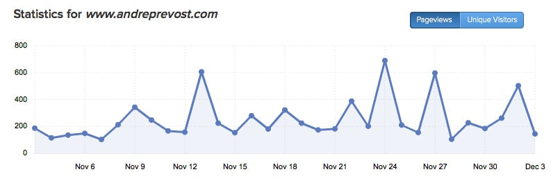 I've been really working at maintaining the website, and the Journals have a following. But even though the stats show a fairly regular increase in page views, I am concerned that it hasn't generated connections with the viewers where they feel comfortable in communicating their thoughts, so important for an artist. I've been wrestling in sorting out what may be the root of the problem. * Is it the iconography itself? * Is it the website itself? * Are people afraid to message me for fear of being hit up for a sale? * What is keeping viewers from connecting with me? * What would viewers want to see added? I welcome your input through the comment section below. Oct. 27, 2015 I've been commissioned to write another icon, and we are determining which saint from a list of 5 - 6 options. I'm also in the process of trying to get my condo ready for listing, so it has been crazy. Once listed, I can begin constructing the icon board out on my terrace to avoid dust in the studio during viewings. Hoping for a quick sale so that I can fully use my studio again. A tiring time but I am focused on the goal. God Willing, my son and I will be in a new home on Vancouver Island very soon and I being able to get back in a good sized studio with workshop space, and my son will also finally have space to rehearse and work on his music. Exciting times. Oct. 27, 2015 I've been commissioned to write another icon, and we are determining which saint from a list of 5 - 6 options. I'm also in the process of trying to get my condo ready for listing, so it has been crazy. Once listed, I can begin constructing the icon board out on my terrace to avoid dust in the studio during viewings. Hoping for a quick sale so that I can fully use my studio again. A tiring time but I am focused on the goal. God Willing, my son and I will be in a new home on Vancouver Island very soon and I being able to get back in a good sized studio with workshop space, and my son will also finally have space to rehearse and work on his music. Exciting times. Oct. 9, 2015 Improvising studio photography 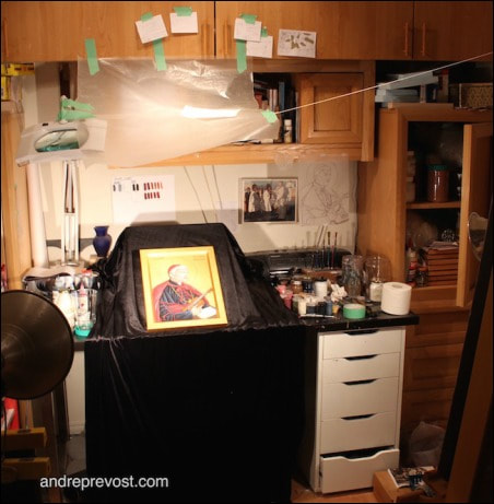 One has to work with the limitations of a small space and no typical photography setup. So I have has to improvize in getting around the glare of lights on the gold leaf. Sept. 30, 2015 My Iconography I had to take a few days to do a demonstration of my painting for the Journeying With The Totems series (part of the annual national Culture Days) and the Pack Out of the exhibition. During the pack-out, I injured my left shoulder. <Note to self: You aren't as young as you use to be!> I'm still sore today but plan on getting back to the St. Cardinal Newman icon as soon as I receive confirmation of using Latin inscriptions instead of English. But I ask for your prayers in this very challenging time. The income from the icons or the paintings has fallen seriously short of monthly requirements for housing costs, utilities, food and other commitments. After putting everything into making the studio work in the last two years, and even with great reviews of my work, it remains an uphill battle. When I started in iconography 30+ years ago, I was virtually alone in the field in Western Canada and I was able to fill a need within both Latin and Byzantine churches. But in resent years, there has been a great surge of iconographers and students of iconography, and with it, for the most part, I have been left to the side. I suppose it is a natural cycle, but difficult none the less, as I have reached my retirement years with only a small CPP and Old Age Security. Artists don't have any retirement plans and benefits. I had also hoped that a mural project that I had presented to a parish would someday be finalized, by I was recently informed that the committee had decided to go with a American iconographer, whose style they preferred. Another reality in a artist's life. In the back of my mind, I have always known that I would have to keep earning an income in my old age, so long as my health allowed. I had not thought for a moment that there would come a time when I would be discriminated against because of my age, making finding employment next to impossible. Employers either set your resume aside as being too old, being over experienced, or not willing to take the time to see how I can be of use to them. They have the false notion that they can get more longevity out of a younger employee, while stats show that younger employees are on the move and looking for other opportunities. So, in faith, I gambled everything to make a go once again of working at my iconography and painting full time, as I had just as much of a chance having enough sales and commissions while being in my studio using my gifts, and matching working full time at an entry level minimum wage job (and not having any time to be in my studio). Even if my health diminished some, I can still paint, while a job becomes finite. But after 2 years+ I seem to have reached a major hurdle where I just no longer have the finances to continue, and the horizon seems totally empty of future prospects. This makes me of heavy heart, and very concerned about that may mean for myself and my son who I support because of his disability. So there is much to think over while keeping myself open in discerning other doors that may present themselves - an hopefully VERY SOON. Grateful for those who have supported me and believed in my work along the way, and I remain hopeful that God will smile upon this lowly artist. Sept. 22, 2015 High Cost of Archival Paint I occasionally get the question of why my icon rates are what they are. People are always shocked, and I suspect unbelieving, when I mention the paint costs. Why archival quality? Why write an icon with gold leaf and then not use archival paint? It doesn't fade in time and assures a long life. So I've attached my last paint order from February 2015, through a Canadian distributor. Not so many years ago, most better art supply stores carried the Golden High Load paints, and at MUCH lower prices. But it wasn't a widely used paint by many artists, and it has an endless shelf life, so there wasn't enough turn over of the product for the stores, and so, they no longer carry it. It now has to be ordered directly from Golden in the States. In 2013 & 2014, I ordered directly from Golden and I had the extra costs of US exchange rate, brokerage & duty, as well as shipping costs to factor in. For this last order, I decided to go through The Paint Spot, a store that I'm well acquainted with in Edmonton. It placed the order for me, tallied their costs and gave me a 30% discount. The only extra that I had to cover was the shipping from Edmonton which was under $40.00. But, you will note two things with the order: 1) The final price tag for the paint... 2) A number of the colours that I use, such as the Cadmium Red Medium, has to be custom ordered with an addition setting charge! There are a few Cadmium colours in this category, and it looks like my favorite, Phthalo Blue, may no longer be ordered at all now. 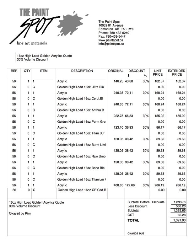 Sept. 31, 2015 2015 Rate Sheet After working with the same rate sheet for years, in trying to help out, the reality is such that costs and overhead costs have increased significantly. By the time I factor out these costs (building and preparing the icon boards, gold leaf, archival quality paints, etc.) I often dare not calculate what is left for my labour. So I've had to review the rate structure for 'Torso' icons, 'Full Image' icons, and Festal Icons. If you have a type and size range of icons that you are considering for a single or series of church icons, please contact me using the above Contact Form with your inquire. Quotes can also be prepared for specially cut icons and for mural projects. For those who were hoping to see my actual rate sheet here, I can't post it online as no other artist or iconographer does that. A rate sheet on its own can be misunderstood without any context as to why (complexity of design, number of figures in the icon, size, amount of gold leaf, and hours which go into an icon, etc.). 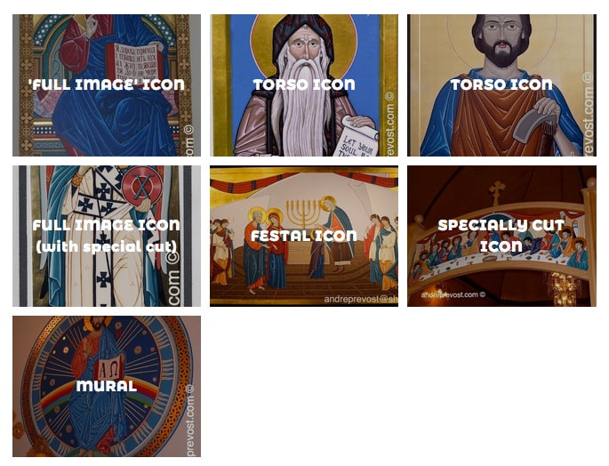 Jun 28, 2015 CAUTION RE LISTING 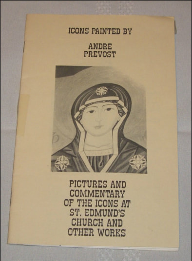 Amazon! I have been trying to file an infringement claim about a bizarre listing on Amazon. It is of a booklet handout that I prepared back in the early 80s (a commentary on the icons that I had just completed in St. Edmund's Church). Just a small bi-folded photocopied booklet of a dozen pages. It is listed on Amazon for, wait for it, $267.54. Yes. That's right. Aside from my suspicions about the absurd asking price, it is listed under 2 'authors', neither one being myself. So I filed the Infringement report on Amazon's website and then received an acknowledgement of receipt saying that investigators would look into it. I then received a form email requesting more information which required me to refill the same Infringement form AGAIN! Frustrated, I did refill the form again, but also replied to the email asking for a way that I could send a few jpegs of the actual booklet in question (my copy of the original). So now, I'm stuck in 2 loops and receiving the exact same 2 form responses! I again replied to the email demanding that I speak with someone about this, so I suppose I will be in a 3rd loop now. Thanks Amazon! Jun 24, 2015 St. Augustine Icon, Victoria BC 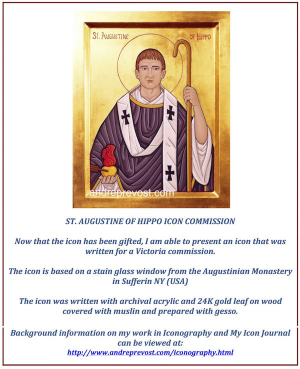 May 30, 2015 Mixing Colours I do love to mix colours. It is my favorite thing to do. I am thankful that I have had a keen sense of colour. It is usually a challenging task as there are so many choices to make and determining what colour(s) is missing. A colour is one thing on its own, and then there is the fact of how an acrylic colour changes when it dries. Then there is using the same colour on two sides of the icon (or canvas) and it looks like two different colours, in relationship to the other colours next to it. Deciding on the base colours (and combinations of) for a piece often requires tweaking; too bright, not bright enough, too cool, too hot, a blue looks grey, or green, a colour looks dead next to the other base colours, etc. And as any legitimate artist will attest, white and black rarely factor in as these with make a colour muddy. I did have someone who said they had taken post secondary art courses for awhile, and advised me to use white and black to brighten or mute a colour! Ummm! No! For example, I wasn't happy with a starting colour tonight which was an orangy red ( almost a Cadmium Red Light ). It looked too orange against the other Phthalo Green colour. Adding a darker Cadmium red corrected the orange but turned it too much to red and still not dark enough. So I added some Burnt Sienna to darken it and to add some red brown to it. It still was looking too red against the Phthalo Green so I added a bit of Cadmium Orange which did the trick. Now, how to describe the final colour... a coral/redish brown? Thankful that I don't have to give a precise name for it, it just works. But no white or black anywhere. I will use some white to create lighter tint of a colour but never just white alone. I will always add another colour if I want to gradually work to cooler, warmer, pinker, bluer, as I go along. For darkening a shade of a colour, I will very rarely use black. Depending on the colour, I will use Burnt Umber for warm colours, Raw Umber for cool, but my all time favourite is Anthraquinone Blue. I generally avoid black in my iconography as it generally represents an absence of God's Light. What will seem black in my icons is anything from the Anthraquinone Blue, a dark Violet, a dark green or blue, a dark grey etc. They will vary depending the other colour(s) they are with. The same goes for white as highlights. Most often the highlights are very light pinks, blue, etc. but appear as white in relation to the other colours. And there's the whole problem of mixing greys!! A tricky colour. Some of the challenges stem from the black being used as many commercial paints can have any number and ratios of colours mixed into them. It can make for surprises when you add it to colours or to white. Many will be variations of a warmer black (brown black) versus a blue black which is easier to control. May 29, 2016 Prepping the Board 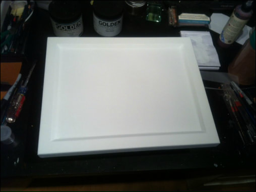 Another icon commission in the works and my fingers are raw from sanding again. :-) The process will take a few weeks. For new followers here, it begins with constructing the board. I use Baltic Birch plywood and frame with oak or maple. I get the frame cut by a neighbourhood cabinetry shop so that the inside edge is at a right angle. Once the frame and sides of the board are wood puttied and sanded, the next step is to adhere the linen or muslin to the surfaces and sides of the board. Because I use an archival acrylic paint, I adhere the cloth with a acrylic gel medium. You have to move fast and it takes practice to get the cloth worked in flat in the inside corners, flat on frame, and on the sides (and outer corners). You have to work out excess gel and air pockets. Once it dries, you trim off the excess cloth, and carefully trim at the outer corner so that you have clean edges. Then you add the first few thicker coats of gesso, which seals the cloth and let dry. I'll give everything an initial sanding to smooth out and texture from the gel medium, cloth and the gesso. After wiping it off, I'll add more coats of gesso and sand again after every few coats. The gesso gets thinned as you build up the layers in order to get a smooth finish. If you don't work the surface until very smooth to look and touch, it WILL bite you when you get to the gold leafing later! 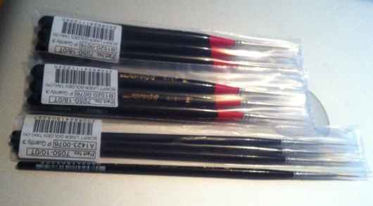 After my quest to find the liners that I've used for years, I had to order them from the States as no Canadian distributor carries this brand anymore! So now, my paint and my liner brushes have to be ordered from the States! Fortunately, they were on sale as the shipping came out to 1.5 times the cost of the brushes. They finally arrived yesterday and so I'll be ok for a while. Feb. 23, 2015 STEPS OF AN ICON ARE NUMEROUS 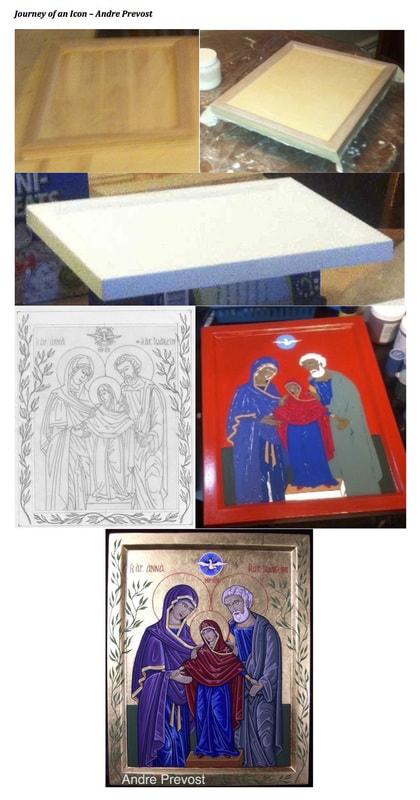 The process of preparing and icon is involved, from beginning to end. The process of preparing and icon is involved, from beginning to end.
The compilation shows only a few of them: 1) building the board and frame, 2) adhering the muslin to the board and shaping onto the frame and sides, 3) gessoeing and sanding the boards (minimum of 7 coats +), 4) preparing a design on vellum which is then transferred to the prepared board, 5) applying the base colours and the red bole where the gold leafing will be applied. After this phase, there is the process of writing the icon. - At a mid point once the main shading and highlights are in place, the gold leafing is done before continuing with the finer details. - Once the gold leaf is done, all inscriptions, haloes, and other ornamentation to go on the gold has to be done with care before the gold can be protected with a sealer. - Once the sealer is applied to the gold areas, the writing of the icon continues. - Once completed, the image is sealed as is the gold leafing. - Note: the only identifier which I add is my monogram on the lower corner on the back of the icon so as not to be view (along with the year it was written). On occasion, there will an additional inscription added to the back of an icon. 6) picture of the icon upon completion |
 RSS Feed