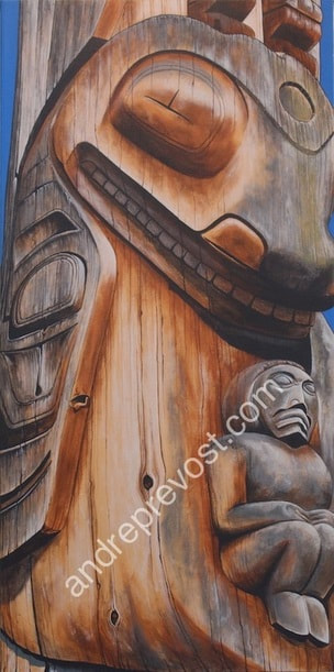
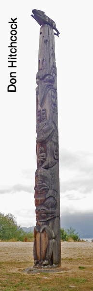
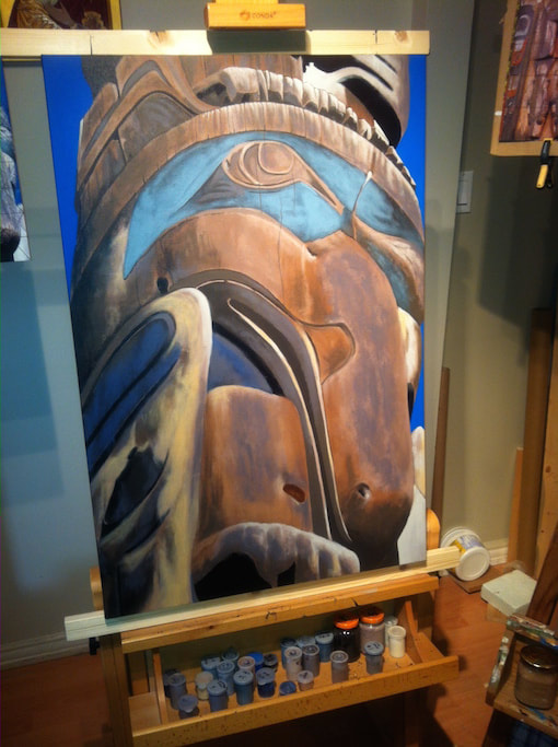
 Killer Whale Totem, 2014 18” x 36” x 1.5” From the ‘Running Wolf Totem Pole’, which tells the origin of the first Gitksan people on the Skeena River. The pole raising was on August 24, 1980 at the Museum of Anthropology, with a large contingent of Gitsan attending. UBC MOA Carved by Walter Harris, a ‘Ksan carver, and family, Richard, Doreen and Rodney. The Nanasimget story: ‘The killer whale is abducting a woman, wife of Nansimget, (whose pursuing husband is depicted lower on the pole).’ After completing the Sentinels painting, I felt the Running Wolf Totem Pole beckoning once again. I had focused on two sections by now (The Frog and the Mosquito). I loved the story behind the other section of the Killer Whale. I also really liked its patina, and thought it could be a great pair to the Mosquito painting if someone was so inclined. As I work through the series, practicality is also present, in exploring with options that art buyers might be considering. The Journey is indeed one of discovery but if this artist has no sales in the process to maintain housing and food on the table for my son and I, then being in my studio becomes very difficult. So I settled on a 18” x 36” canvas. You can see the physical connection to the Mosquito feet just above the Killer Whale’s head. The gray patina was less pronounced on this section and with the deeper carving for its torso, there was more bright cedar catching the bright sunny day when I was there.
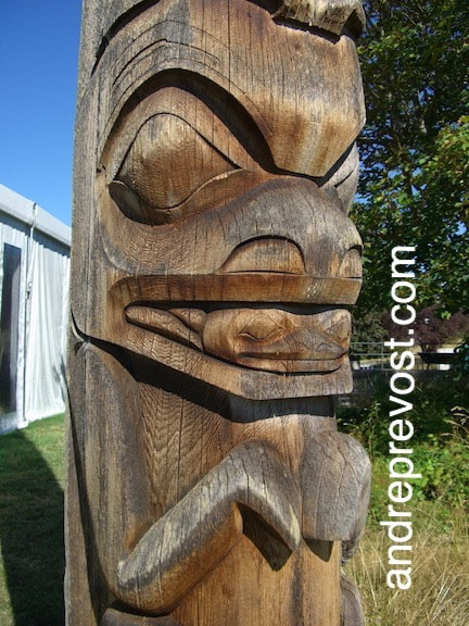
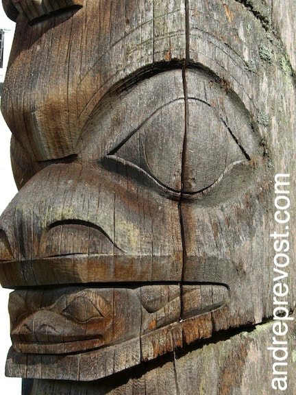
The carved contours were rounder and the soft cracking followed the ebb and flow of the surface. As two paintings never come out the same, even when you are doing another copy, the shading in the pectoral fin has more of a dry brush effect (even though I use my fingers) and the inset ‘Ovoid’ and ‘U’ patterns are deeper. There are a number of interesting carved details that took all of my skill and observation. Each carved shape/line reacts and changes differently as shadows or highlights: ~ around the upper eye and to the blowhole on its forehead, ~ the bottom of the Mosquito’s wing, ~ the inset carving around the cheek and along the lower jaw. There were numerous layers required in developing the multi-colored patinas and thin mosses on the whale’s snout and the very smooth surface of the ovoid protruding eye. It is very much a two steps forward and 1 step back process. If I’ve gone too far with developing a colour, I am able to lightly work in some of the earlier undertones that I lost. This can’t be rushed. What do I see in the original photograph? Is that what I see on the canvas? If not, why! The reflective glow onto the mouth and teeth is another case in point. It takes successive watery glazes of colour to get the shading just right and differentiating between the surfaces directly in the sunlight and those reflecting the light off the chest of the whale. The last finicky detail was the woman on the whale’s chest. Her carving was very gentle and simple in form. The wood grains or fine cracking in the carving are very subtle, and those that could be seen, all had to conform to the carved shape. It gets tricky at times because a wood grain in a deeply chiseled surface will often not follow the path you assume. You need to visualize the negative space that was removed. For example, the wood grain of the upper arm may not necessarily be the same one that you see on the upper thigh. Also, with the simple form of the carved seated woman, it was tempting to use the same technique as on the rest of the totem. But that wasn’t on the carved woman. Her patinas were very gentle on the smooth carved surfaces, seeming so blended in comparison to the whale’s chest right next to her. When in doubt, I stick with what the original is telling me, for that moment in its timeline. I was pleased with catching the warm cedar bright spots from the sun on the whale’s eye, its lower cheek and nostril, the top of the pectoral fin, its chest, and at the Mosquito’s feet. Another note is the pectoral fin which is seen on the far right next to the woman. It is nowhere as refined as the pectoral fin on the left. It isn’t. Being on the side which is constantly exposed to the sun, the wood degrades much faster. As an example, I’ve attached a picture of the Frog section from the north side of the totem (the angle I used for the Frog painting), and the extremely sharp contrast of the Frog’s face facing south. Amazing on how these two images are in fact two halves of the same totem. * See images
0 Comments
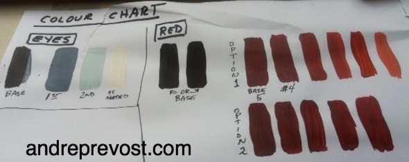
Before I continue with the next in the Journal series on the individual paintings, I just need to air the weight of a heavy heart. I just wanted to clarify that my focus in the journal series on the individual paintings is to present the background of my own journey with the great treasures of the West Coast Masters, and not as an anthropological project. I do record key bits of information about each totem within each journal entry, to remain faithful in honouring the totems and their creators.
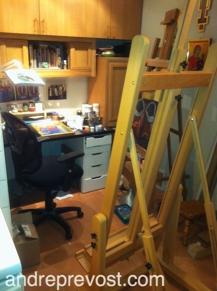
I had been shunned by a few non First Nations artists because of my series on the totems, which already weighed on my heart as these are artists whose work I respect. And it does pain the heart when the same respect isn't applied to me. But I've already touched upon this in an earlier journal entry. But I was saddened that a First Nations artist that I have the world of respect for, had recently unfriended me on Facebook, probably connected to this series or related to my attempts in trying to get a few more sales in order to eat and pay the bills. There may have been concern that I had created a jpeg of one of my paintings with a Christmas bow on it to try and get a more festive message out. But there is no way to know. Unfriending doesn't explain anything. It weighs on my heart, as I am an artist after all, complete with the sensitivities that goes with the package. I am simply following my heart and passion and yes, I know that I overthink the integrity thing, but that is me. But as a struggling artist, even though a few have commented on how amazing my work is, I still struggle to survive, and it weighs on me to know that some whom I respect, chose to sever a tie with me rather then engage in a dialog. I truly feel that my sincerity and deep sense of integrity in my work, deserves the respect of being given the opportunity for that dialog and to be heard. The artist in me needs that affirmation of knowing I have allies out there. Otherwise it becomes a very lonely place. I suspect that a recent email exchange with a granting body also had that underlying shun because of the focus of my current series and that it currently does not officially have First Nations artists connected to the project to sanction it. It is a completely new niche and I understand that there is a concern of setting a wrong precedent in making any statement about Andre Prevost and his work. God knows that I have tried to find that beginning of dialog of my work, and when I do get that chance, those I speak with, understand what I'm doing. I've had a long life of being the square peg trying to fit a round hole. My years as an Iconographer was the same. A French Latin Rite guy writing icons, who has a deep love for the Byzantine Rite but could never be fully accepted because I am not from the Slavic heritage. Some couldn't wrap their minds around that. And in recent years, even with my body of work in that field, fewer and fewer Byzantine communities are using my services as a growing number of Slavic Iconographers have established themselves in Canada. That is natural in the grand scheme of things, but even though I understand that, it makes it no less heavy on the heart, and doesn't alleviate the feeling of being cast aside. For some, my work is too Byzantine, and for others, not Byzantine enough. So it comes as no surprise to me that I find myself in another similar quandary with the Journeying With The Totems series. I am not from the First Nations heritage but so love its art and culture. But again, it leaves me still straddling that fence. Maybe one day. I remember being told that, when the dearest mentor in my life was in his dying days, voicing his biggest question about his life, "Did I make a difference?" I undertsand that question. 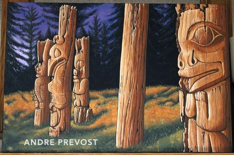 The Sentinels 2014 24”x36”x1.5” Ninstints or Nan Sdins , Haida Gwaii As I was working on the Blue Totems painting, my sister in Calgary asked if she could commission a painting of the iconic totems from Haida Gwaii. I was initially unsure about doing more of a landscape painting, but I then capitulated and thought I would give it a try. But I was also feeling the crunch of the lack of space in my small condo. I had hung what I could of the series to date on my condo walls, but had run out of space to store the rest, along with new canvas etc. So before I could continue, I had to pack away the dining table set into my bedroom (yes you heard right) and built a storage unit for my dining area. That also allowed me to extend my studio a few more feet. I then had to build a partition between the now storage space and the living room (now my son’s bedroom). So it is all very cramped! *see images
Once that was all done, I was able to begin on the commission, based on the famous images of the totem grouping. My sister especially liked the lighting from the late day sunset in the image that we had selected. I liked that option because the painting would still be about the totems and not having to compete against a background of natural daylight trees. There was strength to that onward gaze of the totems, all in the same direction, facing into the bright sunset against that dark background which was tempered by that gentle sky. I decided to set up the painting in a stronger position by cropping off along the edge of the last totem on the right (as in the original photo, the tree truck in the back was dead space). I had tried different canvas size layouts and determined that the 24”x 36” landscape size would be best. The painting would have a strong solid image at the right (with the totem being a sentinel that blocks and protects) and with a more open section on the far left. I then reworked the design to break up the black background on either side of the central post, reconfiguring the trees and sky section by adding more sky coming through the dense clump of trees in the shadows. The lavenders and blues needed to be stronger to balance with the ambers of the sunset, and make the background less ominous.
As I developed the painting, I opted to cool down the amber so that the wood tones and details could come through more, as well as keeping the autumn colours of the grasses more natural. Having done that, I needed to add just a bit more light to the treetops, catching some of that late day sun. I used other reference images of the totems, which had been taken in earlier years in order to determine what I was seeing in the sunset photo. The totems are in varying degrees of decay and it was difficult to see the carving, especially the ones on the far left. When the painting was completed, the nerve-racking time of shipping was at hand. I am always uneasy about shipping because no matter how well you pack a piece of artwork, as with my icons, you can never assume that the carrier(s) will take due care. So I always err on the side of over packing rather just to be safe. It arrived safe and sound to its home in Calgary. Commissioned and owned by - David and Giselle Brunel, Calgary Alberta inks to other reading about the site of these wonderful totems;
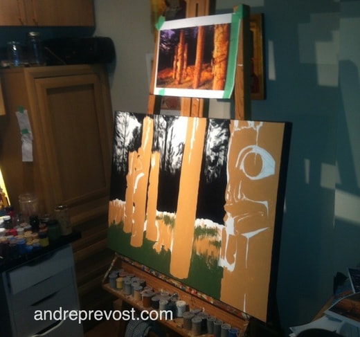
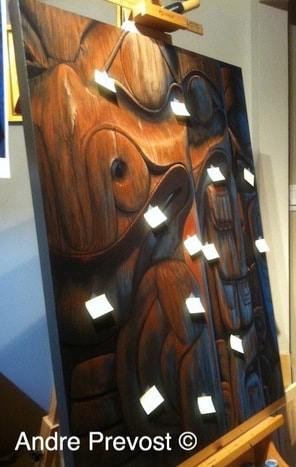
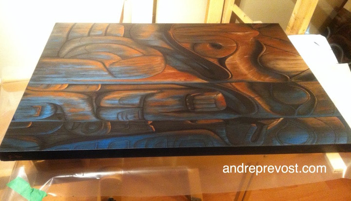
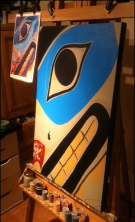
http://whc.unesco.org/en/list/157 https://www.youtube.com/watch?v=iYFDuFzWUuk 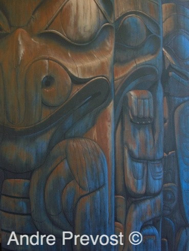 Blue Totems, 2014 30” x 40” x 1.5” Sections from a House Frontal Totem Pole which once stood before a dwelling named 'Plenty of Ilimen - Hides in this House.' It belonged to an the clan named 'Those Born at Qadasgo Creek.' UBC MOA Collection (Left: Grizzly Bear / Centre: Cormorant / Right: Eagle) _________________ After completing the Eagle Totem painting, I felt compelled to tackle something new once again, and on a larger canvas. Not being sure what that canvas size could be, I worked through my library of images again, and came back to the House Frontal Totem sections at UBC MOA. I had used these in the very first painting and they would fit a rectangular canvas. But how could I present them a second time around. I had one image that I liked but it had the usual problem of being an indoor photo that I had taken, being too dark and gray. I used my photo editor to see if I could adjust the brightness and colour. I experimented with the various options of saturation etc. One result came out looking like a late day shot where the above lighting was more amber and I was taken by how the lighting from the window took on a beautiful night blue. It had a wonderful sense of calm and mystery to it. So once having picked the image, I chose the 30”x40” canvas size and proceeded to paint out the large white surface. The base colour for this canvas became an interesting problem. I painted the whole surface with a dark brown, only to find that once dried, it was too light. The sample on a test paper looked too dark but not so on a large scale. So I darkened the brown and tried again, but it was still too light. How dark can you go before it becomes almost black! On the fourth attempt, I finally had the correct base colour, and it still read as a rich brown. So why so much concern about a base colour? Because of my technique of keeping all original colours coming through. Because of the very dark base I had to lightly draft the design, as I didn’t want lines coming through the paint. I had cropped the image so that it appeared as though each successive section was ½ the width of the one in front of it, enhancing the going off in the distance. The major feature that I had to develop right from the start was the two light sources. From the left of the canvas, the presence of the overhead amber lighting was at its strongest and the other totems caught some of the light (but less so). From the right, the strong blue was the strongest, and lessened as you move to the other totems. It took numerous attempts to get the gradation right in both directions, after stepping back to see how the canvas was progressing. I continued to bring up the rust browns and highlights on the Grizzly Bear to bring out the wood tones and the heat from the light source, as well as the two sources of shadows. I enjoyed working out the Cormorant and the Eagle, working the warm to cool within each, and getting a clear distinction from one section to the next. The shadows from the overhead light source became broader as the light lessened and by the time you were at the Eagle, the overhead light just picked up just the front of the forehead and tops of the bridge of the nose and details on the chest. I continued to add glazes of the blue to further intensify the Eagle and then get the balance right (full/mid/light) while working to the Grizzly. When I reach a point where I am close to completing a piece, I usually make mental notes of details to take care of as I do a thorough visual scan. But this one was more involved and I knew there were too many fine points to remember. So I resorted to using small post it notes. Some may wonder why there is a need for being so finicky. That is my style and method, both with my icons and with this series. I’m not doing ultra realism, but for me, the details are equally important. I just can’t allow myself to cut corners. *See image
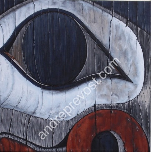
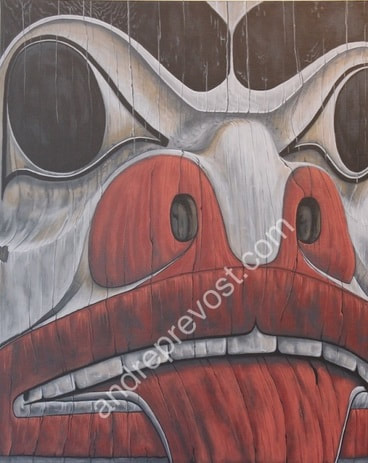
 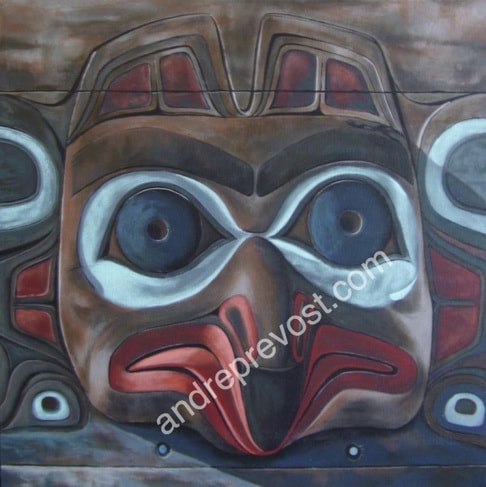 Eagle Totem, 2014 Acrylic on exhibition canvas 24” x 24” x 1.5” From the Mortuary Totem Pole With Grizzly Bear Crest, UBC MOA. Carved by Bill Reid & Doug Cranmer “The frontal board at the top is Bill Reid’s own creation and represents Eagle…However, with the knowledge now gained over years of association with Haida culture, he points out that Eagle was inappropriate, because this crest does not belong with the Bear Mother story. As this mortuary pole was not intended to be functional, it has no cavity. The pole was on display at the Spokane World’s Fair of 1974.” LOOKING AT TOTEM POLES - by Hilary Stewart With the completion of the Brown Bear painting, I received the confirmation of the Silk Purse Gallery exhibition in January 2015. I felt a need to move faster, cranking up the production of the paintings. But I fought that urge, reminding myself that the process of letting the totems guide and taking the time that they needed. It is what made this series and if I was going to remain true to them, this was how I had to continue. So back to my library of images. The totem that was speaking to me at this time was the Mortuary Totem at UBC MOA, especially the top panel with the Eagle. Again, I was taken by the seemingly opposite positioning of a gentle image, which brought a smile to my face, while still being on a Mortuary Pole. I realize that this thought is through European eyes. And I am OK with that as that has been my approach all along, being sincere in my love of these totems, and allowing myself to respond to them from that simplicity. But for myself, I was taken by Eagle’s gentle, youthful face. I just needed to paint it. I decided on a 24”x24” canvas even though the board itself was rectangular. I wanted to focus on that wonderful face while indicating some of its surroundings features. I was initially thinking of using the similar texturing and graining as in the earlier paintings but I found that I was heading a different direction. I was using a gentler, blended technique, following the open features of those eyes, ears and youthful beak that were speaking to me. Actually, what influenced my overall approach was when I was blocking in colour on the surrounding flat board (above and below). I liked how it visualized the aging patina of wooden boards. In developing the ears, which were carved into that same board, I knew that I didn’t want to add graining and cracking for this painting, and just focus on how the light played on its contours, and the shadows created. One new element that I was seeing in my painting, again always guided by what I am seeing in the original image, is how colours radiate light from neighbouring surfaces. There is an inner glow about it. Please note the example of the section of the beak in the shadow. There is a glow to the reds as it follows the contours. The inset carved areas around the eye is another case in point. 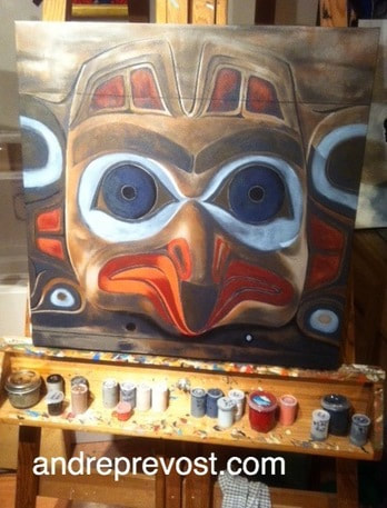 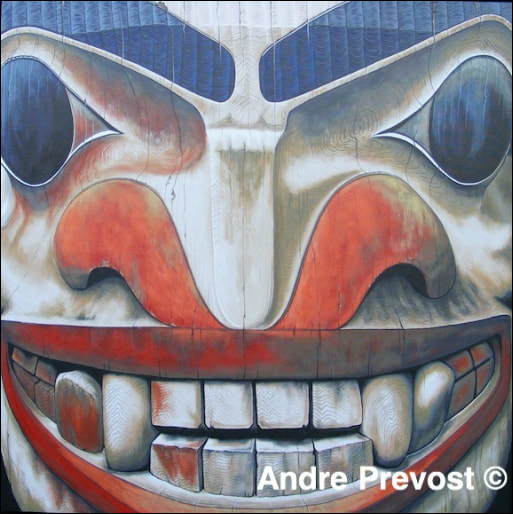 Brown Bear Totem, 2014 36” x 36” x 1.5” From the Bear Pole at Capilano Suspension Bridge Park. The pole tells the story of an abandoned blind man saved from starvation by a bear who brought him fish to eat. The blind man's descendants became known as the Bear Clan. After completing the smaller ‘Watchful Eye’ painting, I felt drawn to an image and storyline that totally captivated me. I loved how the image was juxtaposed as seeming contrary to the nurturing story, of the brown bear coming to the aid of the abandoned blind man. There was that menacing toothy grin, and yet, having read the story, I could no longer see the face other then gentle and loving. It was a compelling image but daunting as well. I was being called to once again reach completely beyond myself. I knew that this would be a major shift forward for me, or failure. The level of detail would challenge any progress that I had made so far. I had considered a square 24”x24” canvas but I felt that the story and the bear’s face commanded more attention, more of an imposing size. So I nervously purchased a 36”x36”canvas. I went back to spend some time with the totem at the Capilano Suspension Bridge Park, even though having the pay the full fee just to see the one totem. The printed image that I had was great but I just needed to be with the totem and set my hand on it. Totems, as does wood in general, have a vibration to them. Life! Once back in the studio, sitting there and looking at a large blank white canvas is overpowering. But I had a good image to work from and the task at hand was to get rid of all the white. I painted the whole canvas in a dark Taupe. I also always paint the sides of an exhibition canvas, as I don’t want any white to affect my colour choices. The design of this totem had the added complexity of the mouth and nostrils. Everything had to be plotted out just right in order to be faithful to the original, and getting the perspective right. The mouthful of teeth was a case in point and then, even though the nose looks simple enough, it underwent a few changes for it to read correctly. I did the usual black for the eyebrows and the eyes and a dark gray for the lips and nostrils. But for the rest of the face, I stayed with the base taupe that I started with. There was so much about this face that was new to me, so many details that I would have to experiment with. There were so many wonderful things that I loved about this face. It is a gem that commands attention. I don’t want to get down to a minutia of all the steps but the process was extensive. I started with my comfort zone of the eyes and eyebrows and then put in some of the shadowing which defined the carving. I wasn’t sure yet how I was going to tackle the graining around the eyes and bridge of the nose, so I decided to begin developing the mouth. If it didn’t work, the whole canvas would be a failure. This is where I spent much time looking back and forth from the image to the canvas. To do this, I keep both next to each other and at the same eyesight level. If something doesn’t look right on the canvas, it is time to study the original again. It is more often a case where a line or the shaping is off, and it just needs a slight tweaking to get it right. When in doubt, ‘trust the original image to inform you’. What am I seeing? What is different on the canvas? The same goes for the colours. For example, this totem was challenging in that there was a wide range of reds, from the bright to more muted, and at various levels of wear on the side of the face exposed to the sun. Once I was able to get the shading worked out for the teeth, I had to grapple the visible wood graining. There were a number of colours within the faint graining, so I began with lighter glazes. I found that I could use a technique that I had often used within my iconography (for fabrics and woods), but going back even further, to the years when I did statuary restoration. Huh? A technique that I used then, when repainting statuary, was taking a small round brush and gold paint, and painting freehand undulating lines on the solid coloured fabric in a manner resembling a gold inlay brocade. I found that with a fine script liner brush and very watered down paint, I could use the same technique for the graining. But for this, I held the original image in my other hand so that I could hold it directly by where I was painting so that I could follow the contours. After that, I would do the process again (and again) with another colour that I could see in the image. But these wood grains had to remain fluid and not be solid in any way, giving definition and shape to the wooden teeth, but subtly so. Now having the confidence of having worked out the teeth and mouth, I proceeded with the similar graining around the eyes, nose, and cheeks. The graining was all done with a brush but all other glazes and shadings were always down with my fingertips. I had to work very gradually as the shades and outlines of the upper face were smoothly carved and the colourings such as the reds around the one eye were so very gentle. The nostrils took many layers to develop the more worn orangey reds and slight hints of mineral deposits from the exposure to the wet climate. Getting the shading right for the cheeks on the far edges of the canvas was important, as the eyes bulge out a bit from the eye socket and cheek bone on the edges. On the actual totem, the edges of the face work back very quickly. I had chosen to crop the image to keep out any visible background (foliage from the trees behind he totem), which was visible in spots just past where I had cropped the image. I had to finely crop in order to preserve as much of the eyes as possible; where they read comfortably as a complete eye, and maintaining their strength. The last detail that I had been avoiding up until now was the carved texture of the eyebrows, along with the shaping of the forehead. When in doubt, I always start slowly and lightly. Like the old cooking technique of adding salt gradually, you can always add a bit more salt as you go, but if you over salt from the start, there is no going back (other then completely starting over). The same goes with painting. Fortunately with acrylic, should that happen, you can repaint a particular area and try again. The other advantage of my technique is that, by painting thinly, I usually don’t have problems with the original paint texture showing through a repainted surface. While working the eyebrows, I stepped back in my studio (backing up from my den and into my kitchen in my case) to see how they were reading. This is a general note for painting. You need to step back to ‘see’ it as the viewer will be seeing it. You can’t do that when up close and personal with the canvas. I would add more colours to pick up the highlighting on the carving, catching the light of the sun on the forehead. So that is the extent of the journey with this totem. This painting will always hold a special place in my heart. Both in the image that it is but mostly because, as an artist, I see the threshold that it led me through. I have a fondness for all the paintings that I’ve done so far, and I am completely comfortable with how the earlier ones are more basic then the recent paintings. But that doesn’t make them ‘less’. They are complete onto themselves and were critical steps of discovery leading to the next. As an aside, when I held the first exhibition of this series at the Silk Purse Gallery, and having hung the series, it was a special moment for me to stand in the middle of the room, and finally see the whole series together. I could so clearly see the progression of a year and a half of solid work through them. Yes it was a series, but each painting was totally distinct from the others. Each had been informed by the original image. I could look at each painting and see how it led to the next. During this exhibition, I had a gentleman recommend that I should have made this painting 48”x48”…even 60”x60”. Aside from the panic that sparked through the brain (at the thought), I just answered that if he wanted one that size, I was up to it. Haven’t heard from him yet. ;-) 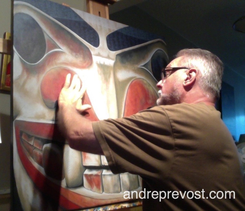 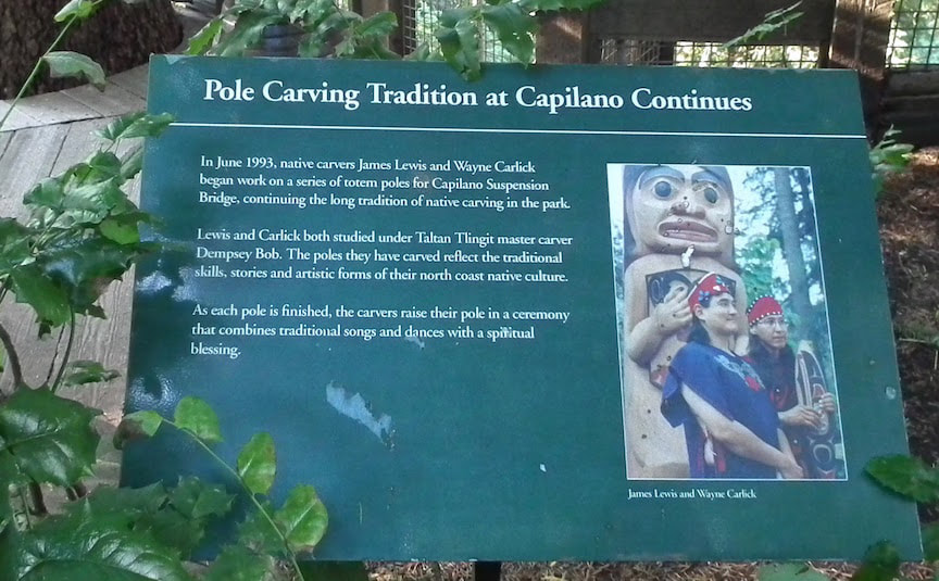 'Brown Bear' is owned by Jinny Rodrigo, North Vancouver , BC
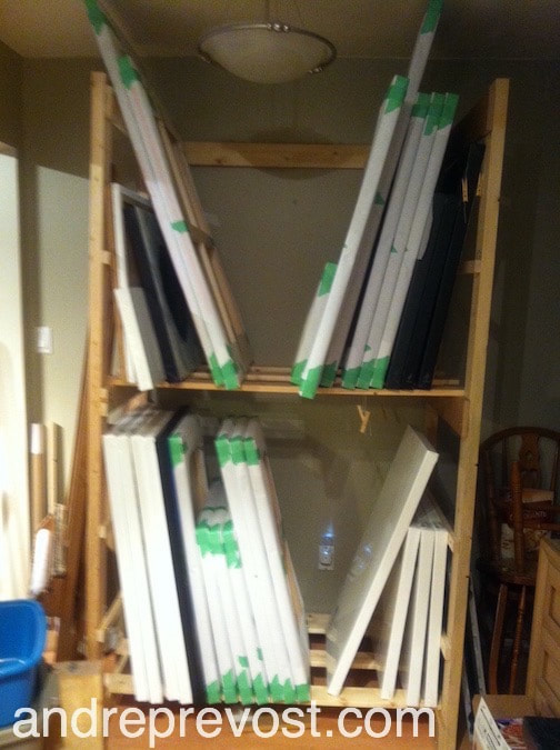
There are three other paintings that I had started earlier but have been waiting until a) I got a few icon commissions done (commission income does take priority in the end), and now b) I get the condo sold and make the transition to Vancouver Island. I've had to pack up much of my studio supplies in the interim. including these 3 canvases along with my supply of other canvases. There just isn't the room for the condo viewings. But once I can get past the point of selling the condo, I can make my studio more functional once again, until it comes time to the final pack and load-out. Hopefully soon! 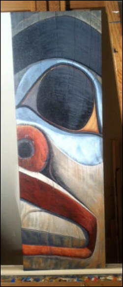 This 12"x36" painting is 75% completed. I just need to further develop the cracks and highlights. I want to keep this one softer overall, similar to the Child/Cub Totem painting. It is a close-up section of the Beaver Totem by Bill Reid, which is part of the outdoor collection at UBC MOA.
|

Archives
November 2020
|
 RSS Feed