|
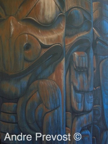
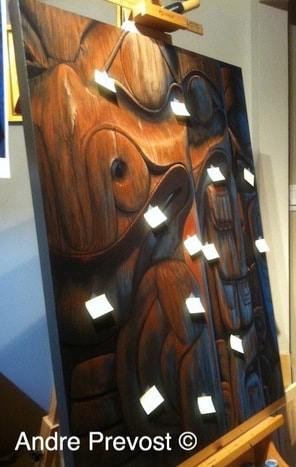
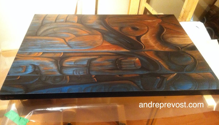
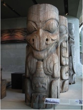
Blue Totems, 2014 30” x 40” x 1.5” Sections from a House Frontal Totem Pole which once stood before a dwelling named 'Plenty of Ilimen - Hides in this House.' It belonged to an the clan named 'Those Born at Qadasgo Creek.' UBC MOA Collection (Left: Grizzly Bear / Centre: Cormorant / Right: Eagle) _________________ After completing the Eagle Totem painting, I felt compelled to tackle something new once again, and on a larger canvas. Not being sure what that canvas size could be, I worked through my library of images again, and came back to the House Frontal Totem sections at UBC MOA. I had used these in the very first painting and they would fit a rectangular canvas. But how could I present them a second time around. I had one image that I liked but it had the usual problem of being an indoor photo that I had taken, being too dark and gray. I used my photo editor to see if I could adjust the brightness and colour. I experimented with the various options of saturation etc. One result came out looking like a late day shot where the above lighting was more amber and I was taken by how the lighting from the window took on a beautiful night blue. It had a wonderful sense of calm and mystery to it. So once having picked the image, I chose the 30”x40” canvas size and proceeded to paint out the large white surface. The base colour for this canvas became an interesting problem. I painted the whole surface with a dark brown, only to find that once dried, it was too light. The sample on a test paper looked too dark but not so on a large scale. So I darkened the brown and tried again, but it was still too light. How dark can you go before it becomes almost black! On the fourth attempt, I finally had the correct base colour, and it still read as a rich brown. So why so much concern about a base colour? Because of my technique of keeping all original colours coming through. Because of the very dark base I had to lightly draft the design, as I didn’t want lines coming through the paint. I had cropped the image so that it appeared as though each successive section was ½ the width of the one in front of it, enhancing the going off in the distance. The major feature that I had to develop right from the start was the two light sources. From the left of the canvas, the presence of the overhead amber lighting was at its strongest and the other totems caught some of the light (but less so). From the right, the strong blue was the strongest, and lessened as you move to the other totems. It took numerous attempts to get the gradation right in both directions, after stepping back to see how the canvas was progressing. I continued to bring up the rust browns and highlights on the Grizzly Bear to bring out the wood tones and the heat from the light source, as well as the two sources of shadows. I enjoyed working out the Cormorant and the Eagle, working the warm to cool within each, and getting a clear distinction from one section to the next. The shadows from the overhead light source became broader as the light lessened and by the time you were at the Eagle, the overhead light just picked up just the front of the forehead and tops of the bridge of the nose and details on the chest. I continued to add glazes of the blue to further intensify the Eagle and then get the balance right (full/mid/light) while working to the Grizzly. When I reach a point where I am close to completing a piece, I usually make mental notes of details to take care of as I do a thorough visual scan. But this one was more involved and I knew there were too many fine points to remember. So I resorted to using small post it notes. Some may wonder why there is a need for being so finicky. That is my style and method, both with my icons and with this series. I’m not doing ultra realism, but for me, the details are equally important. I just can’t allow myself to cut corners. *See image
0 Comments
Leave a Reply. |
Archives
November 2020
|

 RSS Feed