|
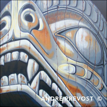
Grizzly #1, 2013 24” x 24” x 1.5” (First study of a pair: in grey) From Kwakwaka'wakw Bear Pole at Swartz Bay Ferry Terminal. Carved by Kwakwaka'wakw artist, Chief Henry Hunt First of a pair with Grizzly #2. After completing the Kunghit painting, I needed to take lessons learned in the first two and tackle more complexity and delve further in the development of colour, both within the aging wood and the pigments (which the carvers had added). I also wanted to choose a subject matter that best suited a square canvas. I liked the symmetry of a square shape. Once I had selected the Grizzly section from the totem at the Swartz Bay Ferry terminal, I spent some time studying the image. I liked the angular position of the Grizzly’s head, but given that it is an indoor totem, the picture I took during a regular rainy day was fairly dark. Once having selected the dark gray base for the canvas, and painting the sides black (to get rid of any trace of the primed white canvas), I drafted the image onto the canvas in the usual graphing technique. I decided to use black for the upper background corners and for all shadowed areas within the carved face. From there I began developing the gray tones. This brings up a part of the process that has become intrinsic to my process. After getting a laser colour photocopy of the image for colour accuracy, and with the superimposed graph pattern, it becomes my master reference from that point on. As I make a colour choice, and once applied and dried, I will often sit with the painting and the original image, to study the correctness of the colour, and if not correct, why. The world of grays is a complex one. There is no such thing as just the colour gray. There is brownish grays, blue grays, lavender grays, greenish grays, etc. And once the paint dries, and in relation to the other colours around it, corrections are often needed. The relationship of colours against other colours is always interesting to me. For example, you can use the exact same colour on two opposing ends of the canvas but because of the colours in between, it looks like you have used two different grays. With this totem study, I began developing more subtle details and layers for the wood. An example would be the teeth. I also reduced the amount of crack lines, keeping the more prominent cracks with the totem and using lighter colours to suggest the others. Different from the Kunghit painting, I also began using a brighter shading to bring out the bright spots on the totem, and to assist its form. The crucial design elements in addition to the upward focus of the totem, were the strength of the nostrils and mouth, and the carving of the upward looking eye. I loved working on this piece, and I was completing it, I felt the need to continue with this image, but try a different approach. SOLD Tim and Monique Mymryk, Winnipeg MB Link to Swartz Bay Terminal Totem Pole:
http://victoriadailyphoto.blogspot.ca/2011/01/kwakwakawakw-bear-pole.html
0 Comments
Leave a Reply. |
Archives
November 2020
|


 RSS Feed